Page 1 of 2
A/B Testing Question
Posted: Thu Sep 18, 2014 3:21 am
by cyberdan
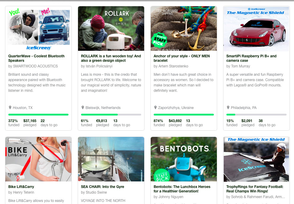
I'd like to get some opinions on what cover image to use for our up coming campaign. Based on the three iceScreen images (top corners and bottom right), which one would catch your attention and get you to click on it?
If you're interested here's the campaign preview
http://bit.ly/icescreen

- Screen-Shot-2014-09-11-at-18.28.21.jpg (176.87 KiB) Viewed 4181 times
Re: A/B Testing Question
Posted: Thu Sep 18, 2014 3:48 am
by Charles
None of the above.
Re: A/B Testing Question
Posted: Thu Sep 18, 2014 12:39 pm
by cyberdan
Thanks for the feedback Charles, direct and to the point. Will need to go back to the design board.
Re: A/B Testing Question
Posted: Thu Sep 18, 2014 12:43 pm
by Charles
cyberdan wrote:Thanks for the feedback Charles, direct and to the point. Will need to go back to the design board.
Based upon a single instance of feedback?
Re: A/B Testing Question
Posted: Thu Sep 18, 2014 1:45 pm
by cyberdan
I posted the same question in a few other places and received similar reactions.
Re: A/B Testing Question
Posted: Thu Sep 18, 2014 4:17 pm
by prismland1
Agreed but out of the 3 I'd say the bottom right. You want an image that very explicitly showcases your product.
Re: A/B Testing Question
Posted: Fri Sep 19, 2014 4:03 am
by MoodyDudes
Top left caught my attention the most!
I liked the words you and me, they stood out. But although it was the most eye-catching, it didn't necessarily most enticing for me to click in.
Victoria Khoury
Moody Dudes
http://kck.st/1u0qr5D
Re: A/B Testing Question
Posted: Fri Sep 19, 2014 2:30 pm
by cyberdan
Thanks for the feedback guys.
I received an interesting comment from an admin at a popular crowdfunding website, they said it doesn't have to be completely relevant as long as it catches the attention and gets those click throughs.
Re: A/B Testing Question
Posted: Tue Sep 23, 2014 1:14 pm
by flashww
love the project
would say bottom left is good shows name of project what it it and someone using it all before you get on the site.
project preview looks good but would also do you research on press before you launch then email out press release before to try and get product out there.
here are some examples for uk mags and shows
letters@bbctopgearmagazine.comMark.mayne@futurenet.comthe gadjet show
customerservices@channel5.comautoexpress@servicehelpline.co.ukadvice@whatcar.cominfo@motorsportmagazine.co.ukcar@bauermedia.co.ukautocar@haymarket.comcarmechanics@bauermedia.co.ukclassic.cars@bauermedia.co.ukthey may do a story on it also check up car forums as i imagine it will be very popular within certain groups and love the mirror idea
Re: A/B Testing Question
Posted: Wed Sep 24, 2014 2:37 pm
by cyberdan
Hey thanks flashww, appreciate the kind words and suggested contact list. We'll add them to our follow up. Good luck with your film!