Page 1 of 2
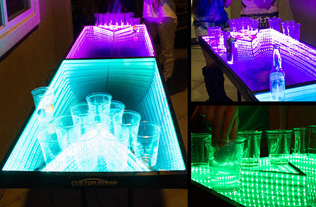
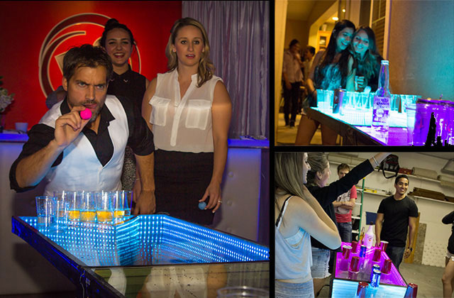
Which thumbnail would you click on? Help me pick an img!
Posted: Tue Mar 11, 2014 7:12 pm
by customglow
Re: Which thumbnail would you click on? Help me pick an img!
Posted: Tue Mar 11, 2014 7:23 pm
by bradAnderson
Greetings!!
To be honest, neither. I like the look of 'A' a lot, but I feel it really doesn't say 'table', I like that 'B' clearly shows what it is, but the words are distracting.
I do like the 'rack' and think if you could incorporate the image to somehow have one of the angles of the triangle pointing directly toward the "pledge" button on your page it might help out... maybe. Just a silly 'artistic' idea. Using shapes to lead the eyes. Since you have a lot of lines and hard shapes, if you kind of have them lead the viewers attention to the "pledge" button it might help out. Who knows? =P
Maybe more of a downward angle of the table. A lot of the 2nd image has just the legs and negative space, which is a waste I think. People understand tables have legs, and unless your legs are super important, I would try to crop them.
Maybe try a 'POV' shot from the person's perspective while playing. Something like [/\] (sorry, at work and can't make images). Then you could maybe list some of your features in the top corners to eat up some negative space with useful info.
By all means I'm no professional framer of photography so take it with a grain of sand. =]
Thanks,
Brad!!
Re: Which thumbnail would you click on? Help me pick an img!
Posted: Tue Mar 11, 2014 7:39 pm
by sbriggman
I really like the lower right and upper right images in the one I've attached

- infinity-mirror.jpg (99.29 KiB) Viewed 3800 times
The upper right image in the one below might get good click through.

- pics1.jpg (90.33 KiB) Viewed 3800 times
Re: Which thumbnail would you click on? Help me pick an img!
Posted: Tue Mar 11, 2014 7:40 pm
by sbriggman
P.S. Love that you are using surveys on the forum to get feedback! I will try to make more members aware of this feature.
Re: Which thumbnail would you click on? Help me pick an img!
Posted: Wed Mar 12, 2014 6:48 pm
by rxqueen
What a cool idea! I would love to play on this table, it would be intense. I voted for image 'A' because when I saw the cup formation I was immediately reminded of beer pong, and then with the LED lights I knew what the product was. While image 'B' made me look closely to make sure it wasn't some type of board game table.
Re: Which thumbnail would you click on? Help me pick an img!
Posted: Thu Mar 13, 2014 4:56 am
by customglow
Thanks everyone, A seems to be winning 2:1 on Facebook so that will be my first choice.
@bradAnderson - thanks, I'll play with that idea and see if I can come up with something interesting.
Re: Which thumbnail would you click on? Help me pick an img!
Posted: Thu Mar 13, 2014 9:01 pm
by Kozy
A gets the vote from me too. Like RXQueen the formation is recongnisable and while the rest isn't immediately obvious, it's less fussy than B.
Re: Which thumbnail would you click on? Help me pick an img!
Posted: Sat Mar 22, 2014 5:57 pm
by Wbatty
I also like A.
Re: Which thumbnail would you click on? Help me pick an img!
Posted: Sat Mar 22, 2014 11:45 pm
by customglow
Two days till launch! Getting nervously excited. I'm sticking with photo A. Here's the preview page if anyone wanted to see it:
https://www.kickstarter.com/projects/2136381407/1782351646?token=ecc57834
Re: Which thumbnail would you click on? Help me pick an img!
Posted: Sun Mar 23, 2014 3:22 pm
by cmuscata
A

